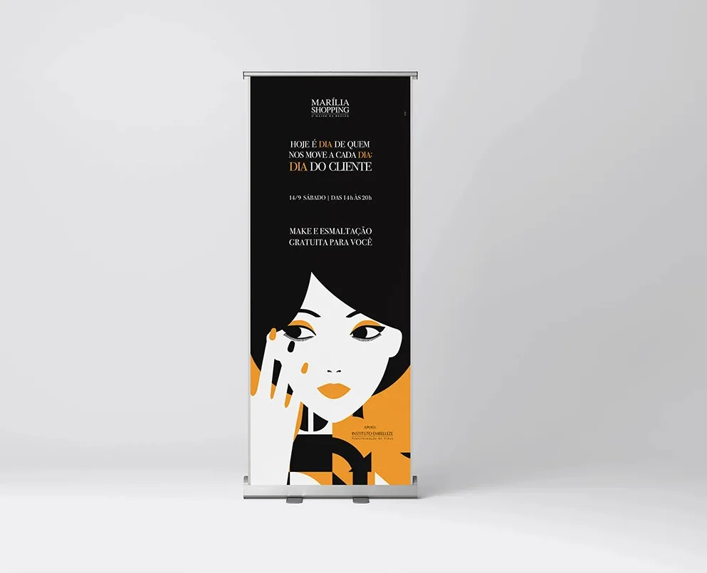
Elevating the category standard locally.
Brazilian regional retail has a predictable visual standard — retouched photography, gradients, promotional typography, a generic saturated palette. It is predictable because it works: it communicates an offer, sells a ticket. But the visual aspiration ceiling is low, and the public ends up consuming an aesthetic standard far below what they see in magazines, global brands, or even on their own social networks.
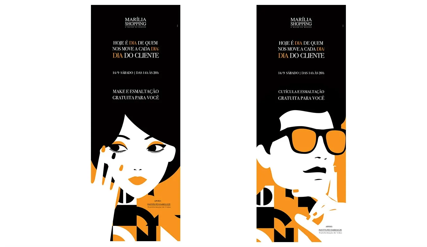
What if a Customer Day campaign in Marília looked like a New Yorker cover?
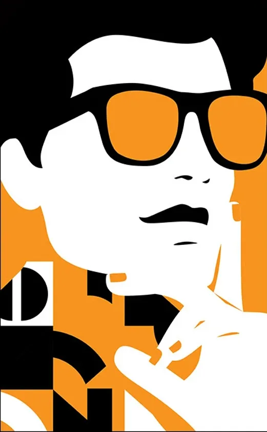
Not to be a distant and inaccessible reference — but to show that the city deserves the same aesthetic care as a metropolis. The choice of Malika Favre's language was specific and technical, not just accidentally aesthetic:
R·01
Clean geometry
Works across diverse formats, from physical banners to Instagram posts, without losing definition.
R·02
Restricted palette
Immediate recognition from a distance — critical for a hanging banner in a mall corridor.
R·03
Editorial style
Communicates "premium" without writing "premium". The form itself is the argument.