Designers spend entire careers building identities for other people's brands. Most never build their own. There's a practical reason — the client is the one paying, and time invested in yourself becomes unbillable time. But the side effect is that the professional ends up without direct evidence on the most important question you can ask an art director: what shows up when they direct themselves?
Samuclima is the honest attempt at that answer.
The Premise of the Name
Samuclima comes from a fusion of nickname and surname — Samu (from Samuel) and C. Lima (Costa de Lima) — but it gains conceptual meaning through what the word clima ("climate" in Portuguese) means in its literal definition: the set of atmospheric conditions that characterize a region.
A climate varies day by day, but maintains a recognizable personality. It's made up of different elements — temperature, humidity, wind, light — operating together. That's exactly how a coherent visual identity works: variation within a system, multiple elements forming a single recognizable atmosphere.
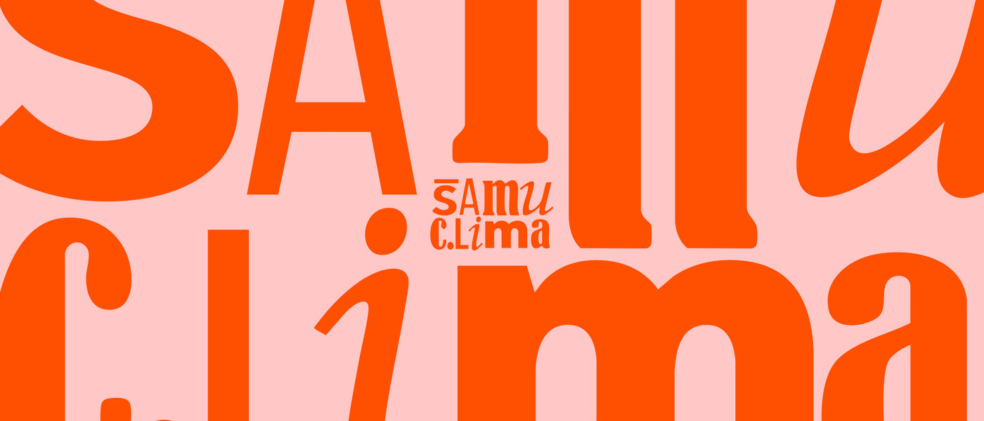
The brand translated this idea literally. The logo is built from multiple different typefaces coexisting within the same word — Monotype Corsiva, Bernard MT Condensed, Sodom Neue, Clarika Geometric. Each character comes from a distinct repertoire, with its own weight, axis, and personality. Even so, read together, they form a single coherent word. The visual identity is literally a set of atmospheric elements forming a recognizable region.
The Brand as a Living System
A static personal identity becomes a portrait. A systemic personal identity becomes an atmosphere. The Samuclima brand was built to be flexible by design:
- Typographic variation as principle, not exception: The brand can be redesigned dozens of times and still be itself — because the rule isn't the specific shape of the letters, it's the principle of typographic coexistence.
- Anchor palette in vivid orange: A color of warmth, energy, presence without aggression. The same emotional place where Samuclima operates.
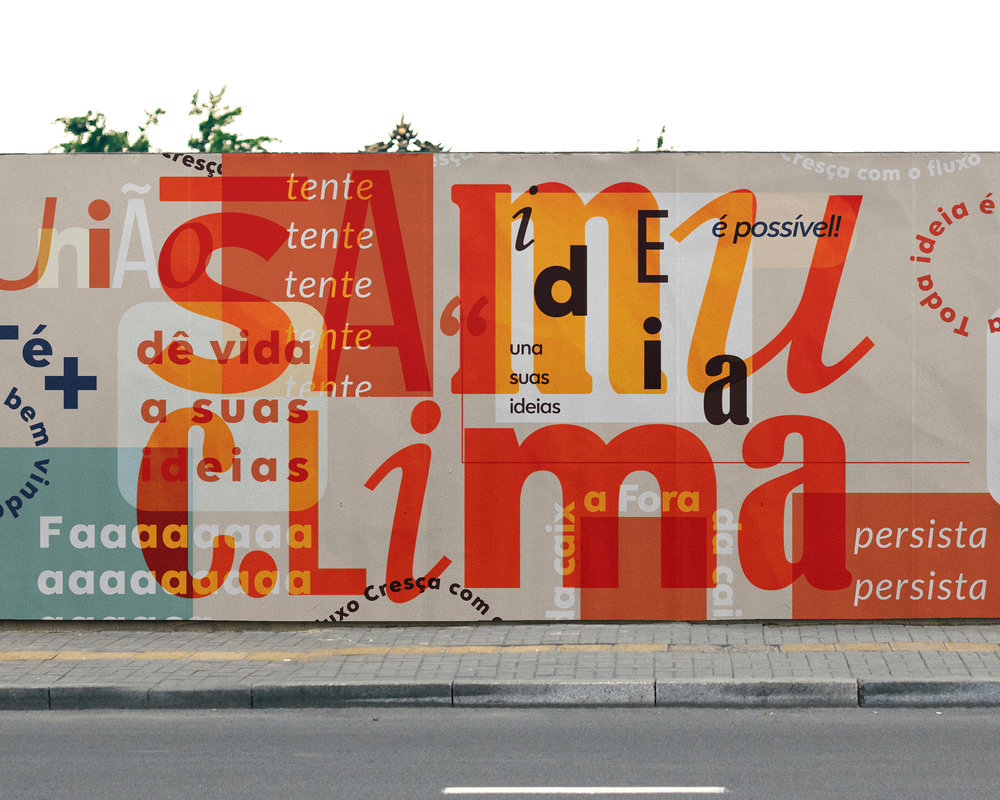
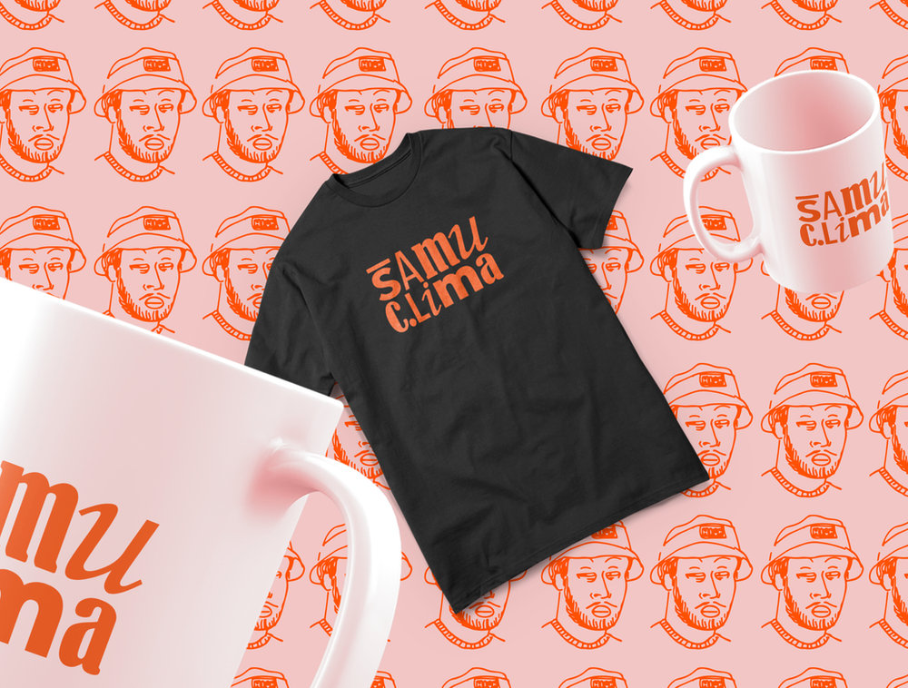
- Application at varied scales: Printed poster, tote bag, urban mural, stationery, t-shirt, mug. The identity holds up in the reduction of a logo on a label as well as in the expansion to a street mural without losing personality.
The urban mural with motivational messages ("try, persist, give life to your ideas") is the most revealing application of the system. It isn't a brand piece applied to the street — it's the brand operating as a public voice, occupying urban space with its own tone. The identity left the PDF and became presence in the world.
This Site Is the Case
The most complete demonstration of Samuclima isn't in the pieces listed in this portfolio. It's the very site you're navigating right now.
Every visual decision in this portfolio is an extension of the brand: the navigation, the tone of the copy, the 3D room that opens each project, the character that reappears in the Climatinha universe, the palette, the typography, the way information hierarchy is organized. The portfolio doesn't communicate about Samuclima — it is Samuclima.
This solves an old problem of the designer's portfolio: the contradiction between form and content. A designer presenting good work on a generic site is saying, without realizing it, that their visual direction only exists under someone else's brief. When the entire portfolio is authorial direction applied, the argument is demonstrated in real time.
Why This Matters Professionally
In a market where visual execution is increasingly democratized — AI generates, templates solve, trends cycle in short windows — what becomes scarce is coherent authorship. The ability to maintain a recognizable visual system across months, years, distinct media and scales.
Samuclima is the ongoing practical exercise of that skill applied to the hardest territory: oneself. The result is what exists on this site — and the evidence that the same skill that sustains personal systems sustains corporate systems.
It's the same direction. At different scales.


Builderall 8: BEYOND
Creative Direction: Visual Translation of the 'BEYOND' Concept — Designing a Bold and Futuristic Identity.

Builderall 7: SUPERCHARGE
The visual energy of growth: an identity that combines strength, innovation, and movement to drive creative and business potential.
Mustache - Social media 2020 - 2022
Designs that communicate: campaigns and visual content created to strengthen brands and build connection on social media.


