
Builderall is an all-in-one digital marketing platform serving entrepreneurs in over 30 countries. In 2024, the company launched its seventh version — Builderall 7: SUPERCHARGE — featuring the Supercharge Bundle: five tools that any entrepreneur could add to any website with a single line of code. I served as the designer responsible for leading the conceptual direction and visual execution of the global launch.
The Brief and the Challenge
"Supercharge" is a saturated word in tech marketing. Energy and power usually come with clichés: lightning bolts, neon, and aggressive typography. But the real tension of the project was conceptual: how to communicate power for a product that, at its core, was a gesture of generosity?
The Supercharge Bundle democratized premium tools. The campaign needed to resolve two opposing energies: inviting strength, rather than pushing force.
Project Constraints
- Deadline: 6 weeks
- Scope: event identity, posters, social media, OOH, billboards, and icon system.
- Brand constraints: global alignment without repeating visual clichés of the segment.
- Responsibility: conceptual direction and execution.
The Big Idea: Encapsulating Strength
The word "Supercharge" carries two movements: compressing (accumulating) and releasing (discharging). We focused on the containment that precedes the discharge. Energy in a state of promise.
The parentheses of the logo were born from that decision. They encapsulate the word "charge", creating the sensation of a button pressed before release — a subtle way to communicate warmth within a concept of power.
The Logo: Two Forces
- Containment and Focus: The parentheses represent Builderall encapsulating power for the user.
- Visual Acceleration: The weight contrast between "Super" and "charge" creates movement within the name itself.
- Welcoming: Rounded corners prevent the brand from appearing hostile.
Visual System: Three Rules
To ensure consistency without reviewing every piece, I codified three fundamental rules:
- No literal symbols: No lightning bolts or sparks. Energy is suggested through composition.
- Movement through composition: Diagonals and asymmetrical cuts instead of blur effects.
- Heat pulse: Neutral base with a warm accent (orange) as punctuation and emphasis.
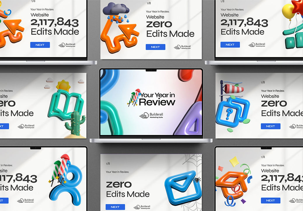
Beyond the Event: Icon System
The scope grew to include the platform dashboard. We created a volumetric visual language for tools like Website Builder, MailingBoss, eLearning, and Booking Builder.
The icons were built in Illustrator with manual volumetric discipline. The result is a system with real mass and sharpness at any scale, which continues to be the official visual language for Builderall tools today.


Mustache - Social Media 2020 - 2022
Designs that communicate: campaigns and visual content created to strengthen brands and generate connection on social media.

Builderall 8: BEYOND
Creative Direction: Visual Translation of the 'BEYOND' Concept — Projecting a Bold and Futuristic Identity.

Samu Clima Identity
Flexible Typographic Design that Symbolizes the Multifaceted Personality and the Concept of "Clima".


